1970s storybook illustrations for KDP books (AI)
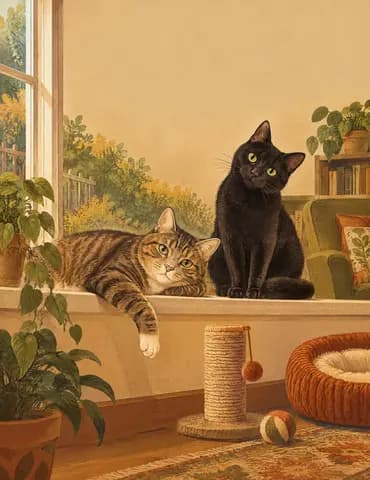
A 1970s picture-book illustration: earthy mustard, olive, burnt orange and brown, soft grainy textures, rounded organic shapes and a hand-painted, nostalgic warmth.
kdpbook.io can illustrate your whole KDP book in the 1970s storybook style: each main character first gets a reference sheet in this style, and every page is drawn from those sheets so the characters look the same from cover to last page. It is recommended for 4 of the 36 book types (including picture book, illustrated storybook and bedtime story collection) and prints in color only.
- Family:
- Vintage
- Color:
- Color only
- Audiences:
- Preschool, Early readers, Adults
- Book types:
- 4 recommended
Already wrote the story? Illustrate your children’s book with AI.

When to use 1970s storybook
Earthy mustard, olive and burnt-orange palette with soft grain and nostalgic warmth.
Best for
Picture books, illustrated storybooks, bedtime stories and poetry.
Better avoided for
Neon, glossy or modern 3D looks, and black-and-white books (color only).
Books that suit 1970s storybook

Picture book
32-page illustrated story with read-aloud text
Ages 0–8 · 24–48 pages · 8.5 × 8.5 in

Illustrated storybook
A picture above, a paragraph below, on every page
Ages 3–12 · 24–96 pages · 8 × 10 in
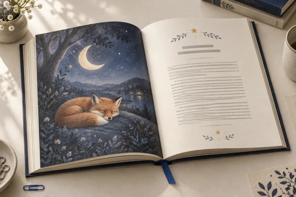
Bedtime story collection
A treasury of calm stories to read at night
Ages 0–8 · 48–200 pages · 8 × 10 in
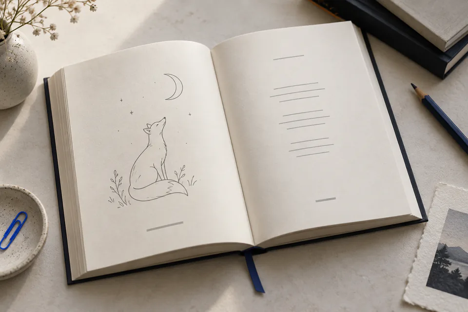
Poetry collection
Poems with generous white space and spot art
Ages 3+ · 48–200 pages · 5.5 × 8.5 in
How 1970s storybook prints on KDP
- The earthy palette prints warm and slightly muted by design, so it holds up well on standard color too.
Every illustration is prepared at 300 DPI or more, as KDP asks. Which interior suits it: premium vs standard color, the printing cost calculator and how to choose the trim size and paper.
Prompt tips for 1970s storybook
Same characters on every page, text typeset over the art: how every style works.
Three tips
- Autumn, forests and cozy homes suit the palette.
- Ask for rounded shapes and gentle characters.
- Nostalgic themes (grandparents' stories, road trips) fit the mood.
Books made in 1970s storybook
Similar styles
Other vintage styles, and how each one differs from 1970s storybook.
- Victorian engraving
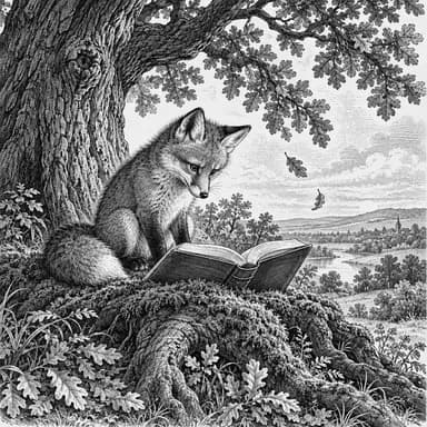
Fine parallel hatching of 19th-century wood engraving, where 1970s storybook has an earthy 70s palette with soft grain.
- Risograph print
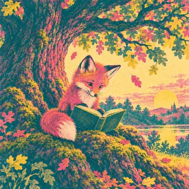
Two or three vivid spot inks with grainy overprints, where 1970s storybook has an earthy 70s palette with soft grain.
- Linocut print
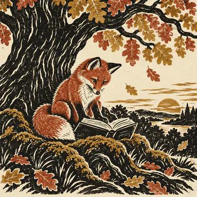
Carved relief shapes with white gouge marks, where 1970s storybook has an earthy 70s palette with soft grain.
- Art nouveau
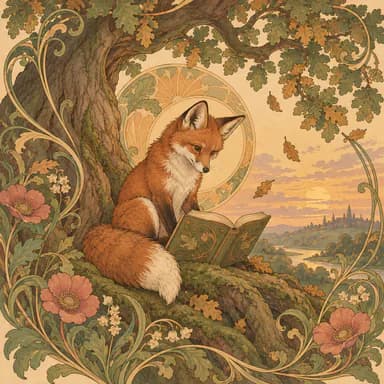
Whiplash curves, halos and flowers woven around the subject, where 1970s storybook has an earthy 70s palette with soft grain.
- Art deco poster
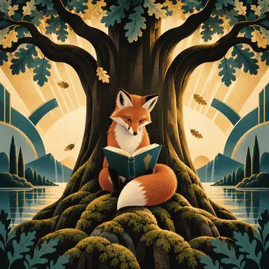
Streamlined geometry, sunbursts and symmetry in black, gold and teal, where 1970s storybook has an earthy 70s palette with soft grain.
About 1970s storybook
Which books suit the 1970s storybook style?
1970s storybook is offered for picture book, illustrated storybook, bedtime story collection, poetry collection. You can still pick it for any other book type, or describe your own style.
Can 1970s storybook be printed in black and white?
No. 1970s storybook is a color style: use it with KDP's premium or standard color interiors. For a black & white book, choose a line-art or ink style instead.
Which colors define the 1970s storybook look?
Mustard, olive, burnt orange and brown with soft grain: warm, earthy and slightly faded, like books printed in that decade.
Is it good for bedtime stories?
Yes. Its warm, muted palette is calm, and kdpbook offers it for bedtime collections, picture books, storybooks and poetry.
Illustrate your book in 1970s storybook.
Describe your book, keep this style, and watch every page get painted with the same characters.
2,000 free credits · no card required